Bandpass Sampling
This notebook demonstrates the bandpass sampling capability in PySM, which enables generating realistic detector-specific bandpass variations for large-scale simulation studies.
What This Is Used For
Bandpass sampling is used when you want many plausible detector bandpasses that are consistent with a measured (or nominal) bandpass. Typical uses include:
Propagating bandpass uncertainty into simulated sky maps and time-ordered data.
Monte Carlo studies of systematic effects that depend on bandpass shape (for example, foreground mixing and calibration).
Building realistic per-detector or per-wafer bandpasses for end-to-end pipeline validation.
Introduction
Modern Cosmic Microwave Background (CMB) experiments like Simons Observatory have arrays with hundreds of detectors. Each detector has a unique bandpass due to manufacturing variations. For accurate systematic uncertainty studies, we need to:
Generate detector-specific bandpasses that preserve statistical properties
Ensure bandpasses are smooth and physically realistic
Control the level of variation between detectors
PySM implements the bandpass sampling methodology used in Map-Based Simulations 16 (MBS 16) for Simons Observatory (https://github.com/simonsobs/map_based_simulations/tree/main/mbs-s0016-20241111#readme), based on kernel density estimation (KDE) with bootstrap resampling.
Methodology
The bandpass sampling process follows these steps:
1. Normalization
Normalize the input bandpass so that \(\int b(\nu) d\nu = 1\). This treats the bandpass as a probability density function (PDF) over frequencies.
2. Cumulative Distribution Function (CDF)
Compute the cumulative distribution function (CDF) by integrating the normalized bandpass:
3. Bootstrap Resampling
Draw N samples from a uniform distribution U(0,1) and map them to frequencies using the inverse CDF. This creates a discrete frequency sample that statistically represents the bandpass.
4. Kernel Density Estimation
Apply Gaussian KDE to the frequency samples to create a smooth, continuous bandpass:
where K is a Gaussian kernel and h is the bandwidth optimized via leave-one-out cross-validation.
5. Moment Calculation
For each resampled bandpass, compute:
Centroid (first moment): \(\nu_c = \int \nu b(\nu) d\nu\)
Bandwidth (second moment): \(\sigma = \sqrt{\int (\nu - \nu_c)^2 b(\nu) d\nu}\)
Example Usage
Let’s demonstrate with a synthetic bandpass mimicking a realistic CMB detector.
[1]:
import numpy as np
import matplotlib.pyplot as plt
import pysm3

%matplotlib inline
import warnings
warnings.filterwarnings('ignore')
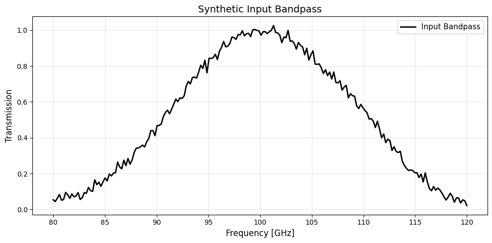
Create a Synthetic Bandpass
We create a realistic bandpass with:
Primary response: Gaussian centered at 100 GHz with 8 GHz width
Secondary lobe: Smaller Gaussian at 110 GHz (common in real detectors)
Noise: Small random fluctuations to simulate measurement uncertainty
[2]:
# Create frequency grid from 80 to 120 GHz
nu = np.linspace(80, 120, 200)

# Primary Gaussian response at 100 GHz
primary = np.exp(-0.5 * ((nu - 100) / 8)**2)

# Secondary lobe at 110 GHz (10% amplitude)
secondary = 0.1 * np.exp(-0.5 * ((nu - 110) / 3)**2)

# Add realistic noise
np.random.seed(42)
noise = 0.02 * np.random.randn(len(nu))
bnu = np.maximum(primary + secondary + noise, 0)  # Ensure non-negative

# Visualize the input bandpass
plt.figure(figsize=(10, 5))
plt.plot(nu, bnu, 'k-', linewidth=2, label='Input Bandpass')
plt.xlabel('Frequency [GHz]', fontsize=12)
plt.ylabel('Transmission', fontsize=12)
plt.title('Synthetic Input Bandpass', fontsize=14)
plt.legend(fontsize=11)
plt.grid(True, alpha=0.3)
plt.tight_layout()
Compute Bandpass Moments
First, normalize the bandpass and compute its statistical properties:
[3]:
try:
    from numpy import trapezoid
except ImportError:
    from numpy import trapz as trapezoid

# Normalize bandpass
bnu_norm = bnu / trapezoid(bnu, nu)

# Compute moments
orig_centroid, orig_bandwidth = pysm3.compute_moments(nu, bnu_norm)

print(f"Original Bandpass Properties:")
print(f"  Centroid (ν_c):  {orig_centroid:.4f} GHz")
print(f"  Bandwidth (σ):   {orig_bandwidth:.4f} GHz")
print(f"  Normalization:   {trapezoid(bnu_norm, nu):.6f}")
Original Bandpass Properties:
  Centroid (ν_c):  100.3993 GHz
  Bandwidth (σ):   7.7338 GHz
  Normalization:   1.000000
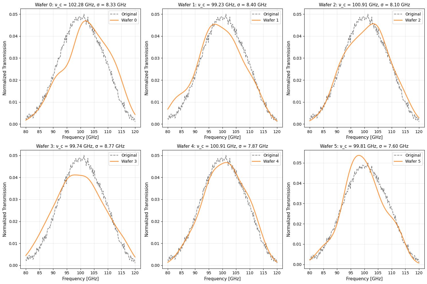
Resample for Multiple Detectors
Now generate unique bandpasses for 6 different detectors (representing 6 wafers in a detector array).
Parameters:
num_wafers: Number of detector bandpasses to generate
bootstrap_size: Number of frequency samples drawn (controls smoothness vs variation)
random_seed: For reproducibility
[4]:
num_wafers = 6
results = pysm3.resample_bandpass(
    nu, bnu,
    num_wafers=num_wafers,
    bootstrap_size=128,
    random_seed=1929
)

print(f"Generated {num_wafers} unique detector bandpasses\n")
print(f"{'Detector':<10} {'Centroid [GHz]':<18} {'Bandwidth [GHz]':<18} {'Δν_c [GHz]':<15}")
print("-" * 65)
for i, r in enumerate(results):
    delta_cent = r['centroid'] - orig_centroid
    print(f"Wafer {i:<4} {r['centroid']:>16.4f}  {r['bandwidth']:>16.4f}  {delta_cent:>13.4f}")
Generated 6 unique detector bandpasses

Detector   Centroid [GHz]     Bandwidth [GHz]    Δν_c [GHz]
-----------------------------------------------------------------
Wafer 0            102.2815            8.3286         1.8821
Wafer 1             99.2292            8.4020        -1.1702
Wafer 2            100.9058            8.1031         0.5064
Wafer 3             99.7438            8.7694        -0.6555
Wafer 4            100.9098            7.8733         0.5105
Wafer 5             99.8110            7.6046        -0.5883
Visualize Resampled Bandpasses
Compare each resampled bandpass against the original. Notice how:
The overall shape is preserved
Peak locations vary slightly (realistic detector variation)
Secondary features are maintained
All curves are smooth and artifact-free
[5]:
fig, axes = plt.subplots(2, 3, figsize=(15, 10))
axes = axes.flatten()

for i, (ax, result) in enumerate(zip(axes, results)):
    # Plot original
    ax.plot(nu, bnu_norm, 'k--', linewidth=1.5, alpha=0.5, label='Original')

    # Plot resampled
    ax.plot(result['frequency'], result['weights'],
            'C1-', linewidth=2, alpha=0.8, label=f"Wafer {i}")

    # Formatting
    ax.set_xlabel('Frequency [GHz]', fontsize=11)
    ax.set_ylabel('Normalized Transmission', fontsize=11)
    ax.set_title(f"Wafer {i}: ν_c = {result['centroid']:.2f} GHz, "
                 f"σ = {result['bandwidth']:.2f} GHz", fontsize=11)
    ax.legend(fontsize=10)
    ax.grid(True, alpha=0.3)

plt.tight_layout()
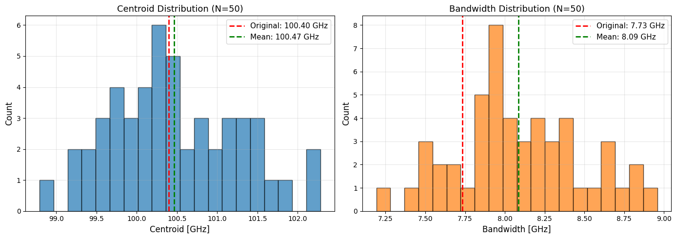
Statistical Validation
To verify the resampling produces statistically valid results, generate many bandpasses and examine the distribution of moments.
We expect:
Centroid distribution: Centered near the original value with realistic spread
Bandwidth distribution: Similar mean to original, with controlled variation
No outliers: All resampled bandpasses should be physically reasonable
[6]:
n_samples = 50
results_many = pysm3.resample_bandpass(
    nu, bnu,
    num_wafers=n_samples,
    bootstrap_size=128,
    random_seed=1929
)

centroids = np.array([r['centroid'] for r in results_many])
bandwidths = np.array([r['bandwidth'] for r in results_many])

# Create statistical plots
fig, (ax1, ax2) = plt.subplots(1, 2, figsize=(14, 5))

# Centroid distribution
ax1.hist(centroids, bins=20, alpha=0.7, color='C0', edgecolor='black', density=False)
ax1.axvline(orig_centroid, color='red', linestyle='--', linewidth=2,
            label=f'Original: {orig_centroid:.2f} GHz')
ax1.axvline(np.mean(centroids), color='green', linestyle='--', linewidth=2,
            label=f'Mean: {np.mean(centroids):.2f} GHz')
ax1.set_xlabel('Centroid [GHz]', fontsize=12)
ax1.set_ylabel('Count', fontsize=12)
ax1.set_title(f'Centroid Distribution (N={n_samples})', fontsize=13)
ax1.legend(fontsize=11)
ax1.grid(True, alpha=0.3)

# Bandwidth distribution
ax2.hist(bandwidths, bins=20, alpha=0.7, color='C1', edgecolor='black', density=False)
ax2.axvline(orig_bandwidth, color='red', linestyle='--', linewidth=2,
            label=f'Original: {orig_bandwidth:.2f} GHz')
ax2.axvline(np.mean(bandwidths), color='green', linestyle='--', linewidth=2,
            label=f'Mean: {np.mean(bandwidths):.2f} GHz')
ax2.set_xlabel('Bandwidth [GHz]', fontsize=12)
ax2.set_ylabel('Count', fontsize=12)
ax2.set_title(f'Bandwidth Distribution (N={n_samples})', fontsize=13)
ax2.legend(fontsize=11)
ax2.grid(True, alpha=0.3)

plt.tight_layout()

# Print statistical summary
print("\nStatistical Summary:")
print(f"\nCentroids:")
print(f"  Mean:     {np.mean(centroids):.4f} GHz")
print(f"  Std Dev:  {np.std(centroids):.4f} GHz")
print(f"  Bias:     {np.mean(centroids) - orig_centroid:+.4f} GHz")
print(f"\nBandwidths:")
print(f"  Mean:     {np.mean(bandwidths):.4f} GHz")
print(f"  Std Dev:  {np.std(bandwidths):.4f} GHz")
print(f"  Bias:     {np.mean(bandwidths) - orig_bandwidth:+.4f} GHz")
Statistical Summary:

Centroids:
  Mean:     100.4677 GHz
  Std Dev:  0.7967 GHz
  Bias:     +0.0684 GHz

Bandwidths:
  Mean:     8.0854 GHz
  Std Dev:  0.3897 GHz
  Bias:     +0.3515 GHz
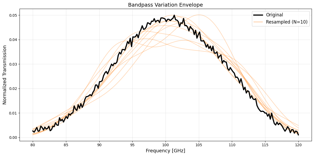
Overlay Visualization
Show 10 resampled bandpasses overlaid on the original to visualize the ensemble of variations:
[7]:
# Generate 10 samples for overlay
results_overlay = pysm3.resample_bandpass(
    nu, bnu,
    num_wafers=10,
    bootstrap_size=128,
    random_seed=2024
)

plt.figure(figsize=(12, 6))

# Plot original
plt.plot(nu, bnu_norm, 'k-', linewidth=3, label='Original', zorder=10)

# Plot resampled with transparency
for i, r in enumerate(results_overlay):
    plt.plot(r['frequency'], r['weights'],
             'C1-', linewidth=1.5, alpha=0.3)

# Add single legend entry for resampled
plt.plot([], [], 'C1-', linewidth=1.5, alpha=0.5, label='Resampled (N=10)')

plt.xlabel('Frequency [GHz]', fontsize=13)
plt.ylabel('Normalized Transmission', fontsize=13)
plt.title('Bandpass Variation Envelope', fontsize=14)
plt.legend(fontsize=12)
plt.grid(True, alpha=0.3)
plt.tight_layout()
Command Line Usage
PySM also provides a command-line tool for batch processing:
# Resample a bandpass file for 6 detectors
pysm_bandpass_sampler input_bandpass.txt \
    --num-wafers 6 \
    --bootstrap-size 128 \
    --seed 42 \
    --output-dir ./resampled_bandpasses/
Input file format (ASCII, 2 columns):
# frequency transmission
80.0  0.01
81.0  0.05
...
Output: IPAC table format files, one per wafer.
Applications
This bandpass sampling capability enables:
Large-scale simulations: Generate unique bandpasses for hundreds of detectors
Systematic studies: Propagate bandpass uncertainties through analysis pipelines
Monte Carlo ensembles: Create realistic detector variation ensembles
Instrument modeling: Model detector arrays (e.g., Simons Observatory’s 6 wafers per frequency band)
Further Reading
See the bandpass sampling comparison notebook for validation against reference Simons Observatory data
Thorne et al. 2017, “The Python Sky Model” (arXiv:1608.02841)
Zonca et al. 2021, “The Python Sky Model 3” (arXiv:2108.01444)